This module was a great introduction to self
publishing which surely is an inherent skill of the photographic industry and
which I as future photographer would like to develop. Also, to me, one of the
main advantages of this project is the fact that I learned how to use Adobe
InDesign which I have never used before. In addition to this, this module
allowed me to develop my skills and expand on my knowledge in terms of
presenting my work in certain, considered order creating visual and thematic
continuity. I personally enjoyed this project as it covered broad range of
different subjects (e.g. photography, typography, design)

Sunday, May 20, 2012
Image Editing- photoshop post-processing stages
I would like to show the way I edited my images. My aim was to produce a quite vintage 'analogue' look as I believe this style reflects the senility of photographed buildings.
In terms of tones and contrast my editing was mainly based on using curves.
 |
| original 'raw' b&w image |
In terms of tones and contrast my editing was mainly based on using curves.
 |
| this is a rough curve setting I mostly applied to all my images. I gives a stronger contrast but also brightens the black parts of an image adding a little bit of 'analogue film camera' feel to it. |
 |
| Before and after the curves |
 |
| As I was very inspired by Tomasz Gudzowaty's work who uses a selective focusing technique I decided to play with blur filters and aplly them around the corners of an image giving a little bit more plasticity. |
 | |
| My final stage was to add some grain to emulate the film grain. |
 |
| To get the best resoult I used a 'linear light' blend mode to apply the grain texture to my image. |
Front Cover- reverse side
During working on my book, most of the time I was sure to leave the front cover reverse sides blank and pure white. However, some day I got a great idea to use one of my images as a double-page spread and create nice reverse of the front cover, inviting and encouraging the reader to flick through the next pages.

Book layout & Back Cover
This is a quick explanation of my book layout. As it is supposed to be a monograph type of book I decided to keep it quite clear by putting single image and text on separate pages. Most of the pages in my book will keep to this layout.

* In my book I also may include some double-page spreads containing more than one image per page.


* In my book I also may include some double-page spreads containing more than one image per page.
BACK COVER

The back cover will contain a text about what the book is about and short explanation of my intentions and the purpose of this book.
Book Cover- my decision
This is my final idea for the book cover. I decided to keep the font quite simple and clear. I chose this font (stereofildic) as it has those interesting arrows pointing down which in the case of my book may represent the economic decline. I think that the overall design works quite well as the bacground does not distract and does no dominate the title but functions as the visual introduction and guide about what the book is going to be about.
 |
| Final book cover |
Book Cover- type experimentation
Here I'd like to show some experimentation with different fonts on my book cover. I was searching for a font which will visualy match the word 'stasis'


Fonts
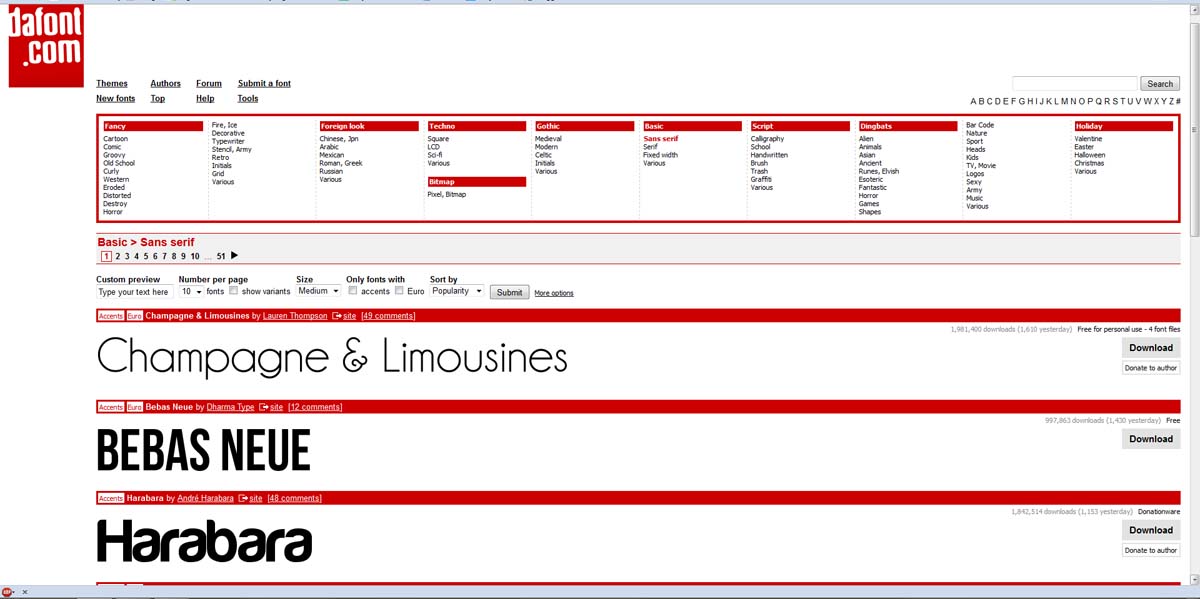
dafont is a great website containing variety of great fonts. I am sure this website is extremely useful for those who search for unconventional solutions in terms of typography and design.
http://www.dafont.com/

Serif and Sans Serif is the main division in terms of font types.
Consider the following characters. The first is set in Georgia, a lovely serif font. The second is set in Verdana, an easy- to-read sans-serif font.
Notice the small decorative flourishes at the ends of the strokes in the left character.
These are called serif. The right character does not have these strokes and is said
to be in a sans-serif font. ( Sans is the French word for without.)
Times New Roman is a commonly used serif font. Arial is a commonly used sans-serif font.
d- serif
d- sans serif
http://www.dafont.com/
Serif and Sans Serif is the main division in terms of font types.
Consider the following characters. The first is set in Georgia, a lovely serif font. The second is set in Verdana, an easy- to-read sans-serif font.
Times New Roman is a commonly used serif font. Arial is a commonly used sans-serif font.
d- serif
d- sans serif
Subscribe to:
Comments (Atom)